 For Owners
 For Sales
 For Production
 For Finance
 Presentations
 Shops
Shops
 Product Mockups
 Client Portals
 Product Search
 CRM
CRM
 Decorator Matrix
 Suppliers
 Navigation & Dashboards
 Production Management
 Reports & Analytics
 Essentials
 Advanced
 Enterprise
 Customer Stories
 Events
 Blog
Blog
 eBooks
 Podcast
 Webinars
 ROI Calculator
 FAQ
FAQ
SECTIONS
RELATED RESOURCES
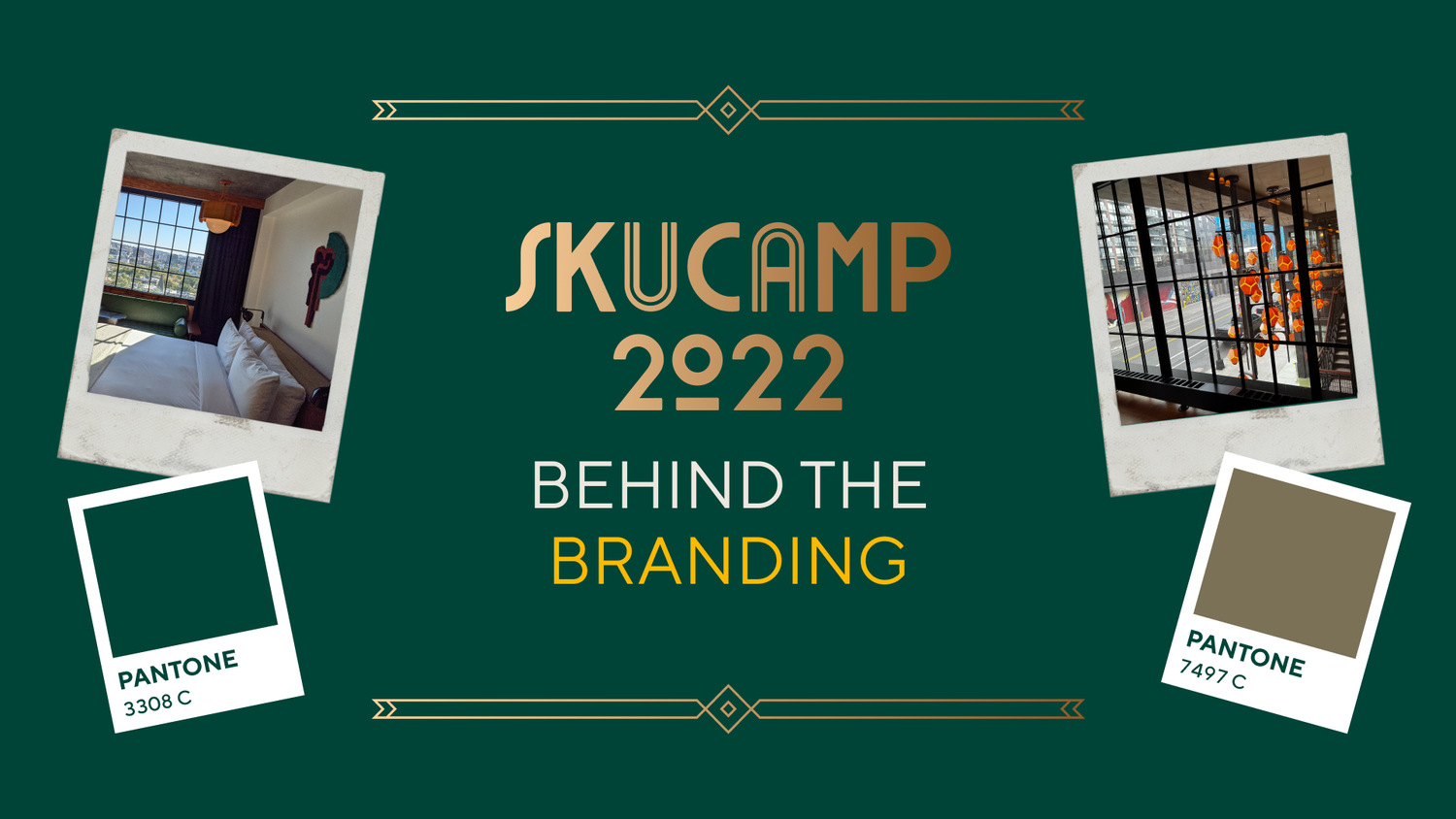
Behind the Branding: skucamp
Choosing the right branding and colors for an event or a project is essential to creating a positive and lasting impression. We’ll be exploring this in our new series, Behind the Branding.
We are always very conscious of the messages we want to send out with our events and what colors best represent us as a company.
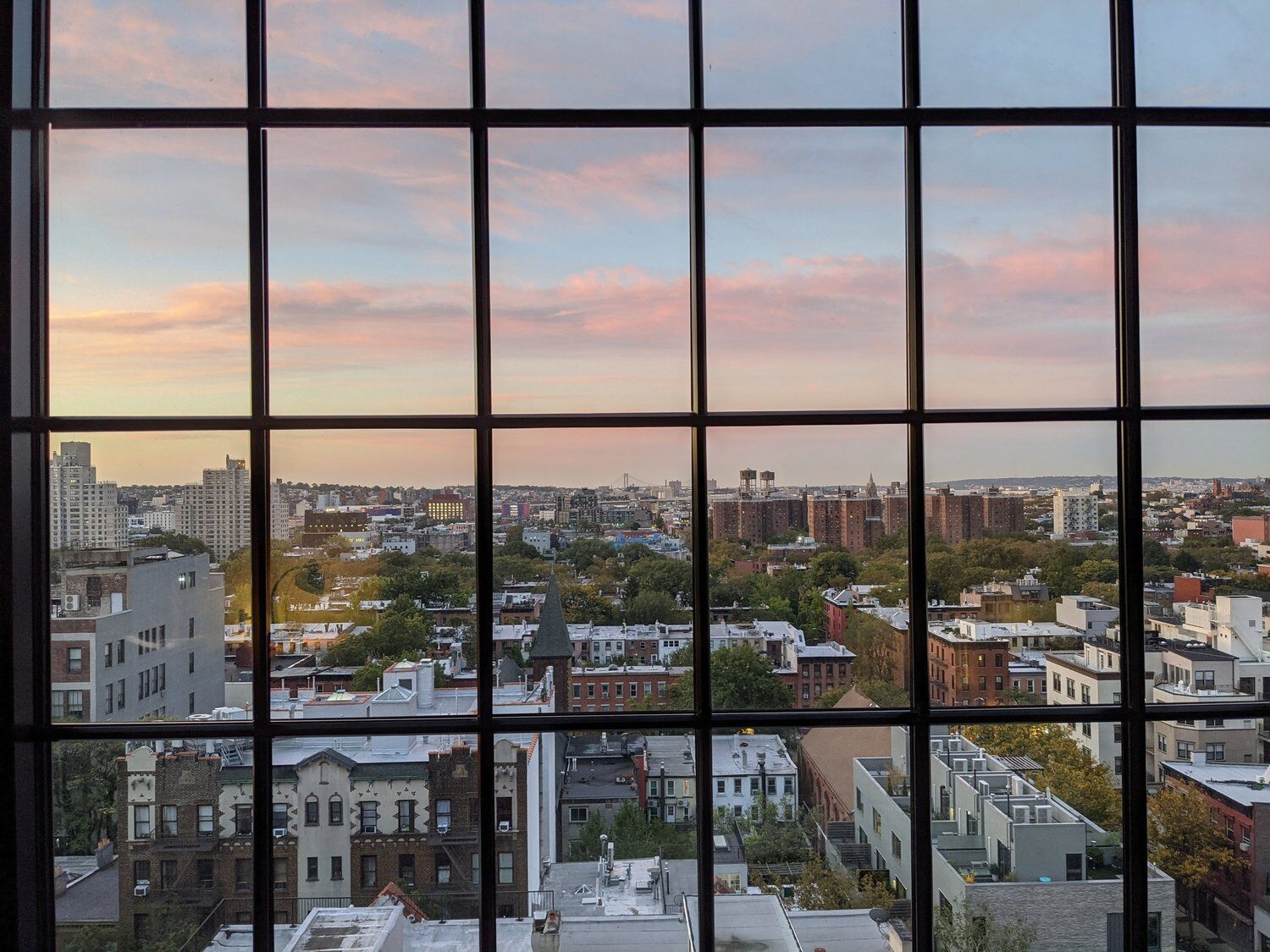
skucamp is one of our biggest events of the year, so we were very mindful of the colors and theme. This year we chose to hold the event at Ace Hotel Brooklyn, which had an impact on the style and overall feel of the branding.


We were inspired by the hotel's overall "Art Deco" vibe and wanted to create a design that reflected that aesthetic, along with the iconic Brooklyn vibe inspired by Le Corbusier, Brooklyn’s rich history of artists’ spaces, and storied stoop culture.
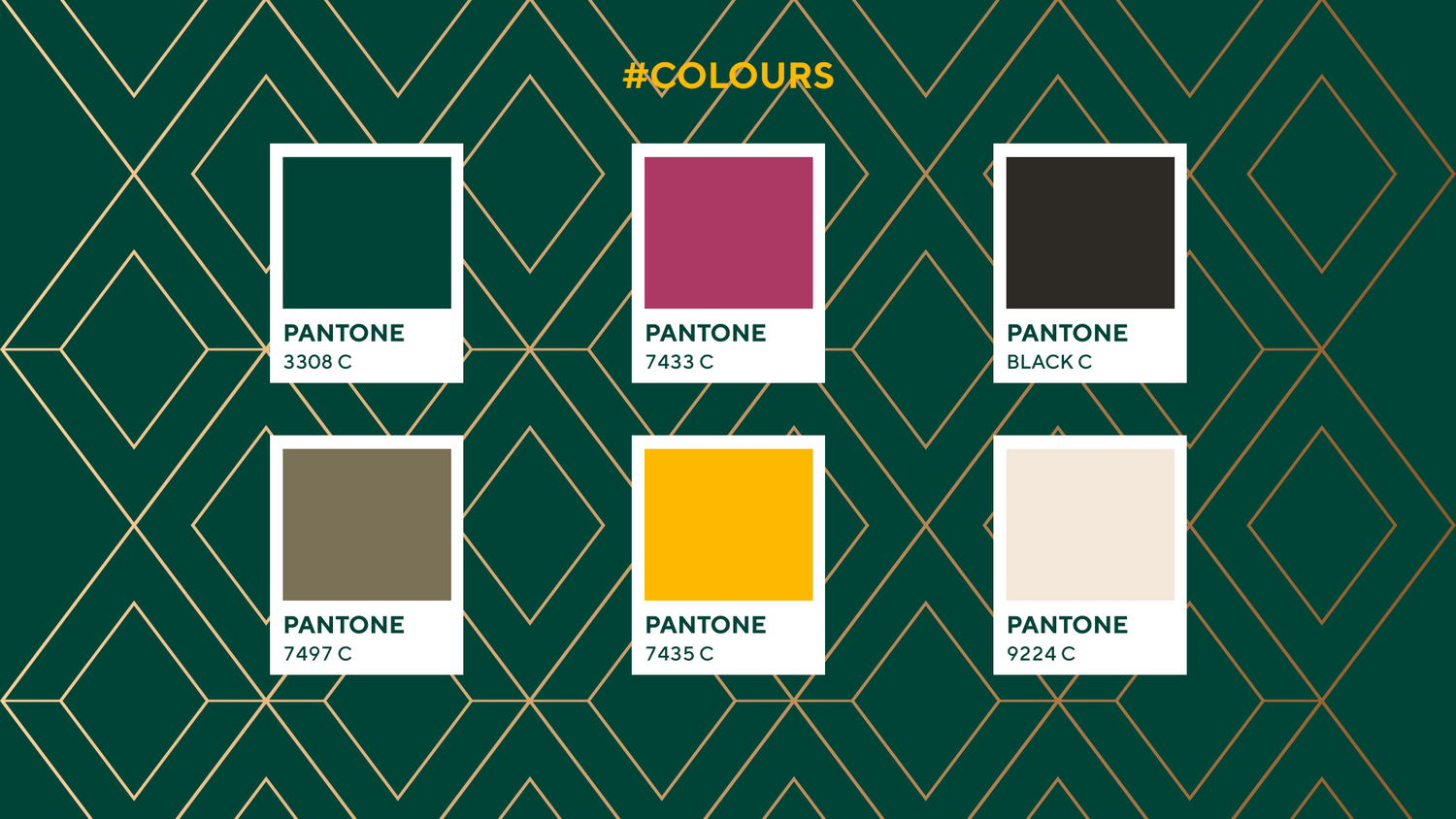
We chose a dark green color scheme with accents of dark pink and gold to tie into the branding of the Ace Hotel. Gold geometric shapes were used throughout the design to nod to the Art Deco style, and the images used to represent some of our favorite things about Brooklyn.
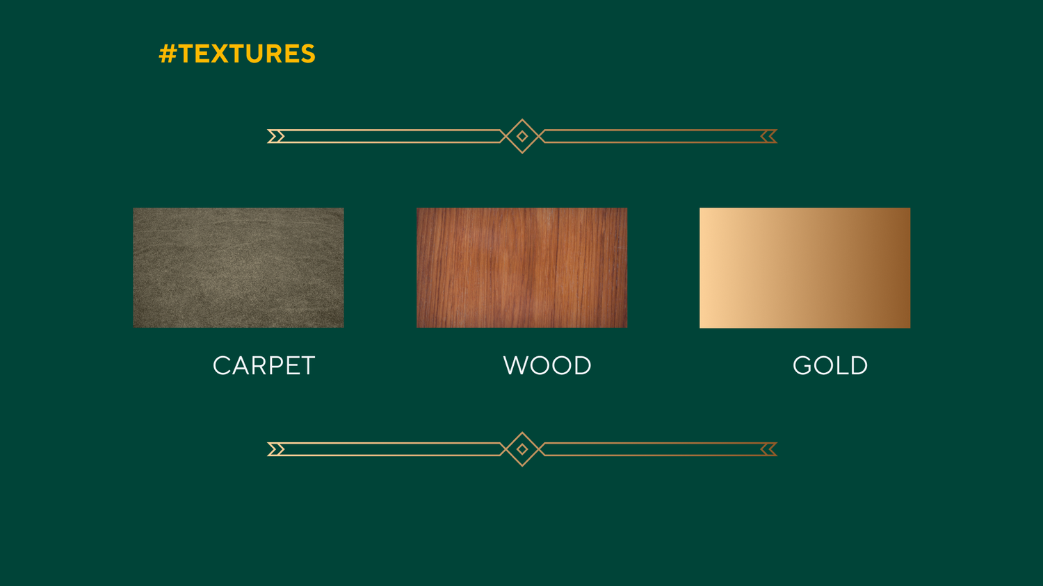
We also incorporated wood and carpet textures in the design to add visual interest to the branding and to emphasize the materials used in the venue.
The final outcome was a clean, modern aesthetic infused with the Ace Hotel's unique character, and we couldn’t be happier with the design!
We can't wait to see you in Brooklyn and fully immerse in the art deco vibe!
Do you have a project you’re proud of and want to be featured on “Behind the Branding”? news@commonsku.com